
Logos are an important part of creating your brand identity. They are usually the first thing that your audience sees, and they are helpful in improving brand recall for your company. For this reason, it is imperative that your logo is eye-catching, memorable and portrays your brand identity.
Why is choosing the right logo colour important?
The colour of your logo is a powerful way of sharing your company’s personality. Your logo colour choice should reflect your business and attract your target customer. The colour(s) that you choose should reflect how you want your target customer to feel when they see it.
What are the top colours for logos?
As a consumer, you’re probably unsurprised to hear that blue is the most popular colour choice for logos, with 33% of the world’s biggest brands choosing it as their brand colour. A close second is red, with 29% using it to represent their brand. Black, grey and silver take a close joint third with 28%. Yellow (the best in our opinion) and gold take joint 4th with 13% of the biggest brands in the world having yellow or gold in their logos.
Colour combinations
According to Zippia, 95% of the world’s leading brands use 2 colours in their logo. This is in order to keep the logo looking clean and uncluttered. Using just 2 colours in a logo also helps to ensure consistency across different platforms and assets in which the logo will need to be displayed.
The psychology behind different colour choices
There is no best colour for a logo. However, colour psychology shows that different colours can evoke different feelings in the people that view them. There is a reason why blue is the most popular colour choice for logos. Colour psychology means that different colours work better in different industries.
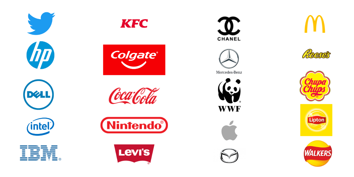
The colour blue in logo design
A study by researchers at Missouri University discovered that blue logos invoked feelings of confidence, success and reliability. This could be the reason behind blue being a popular choice for banks and finance companies. Blue has connotations of being calming, and so this can build towards feelings of trust and success – which is what consumers want from a bank.
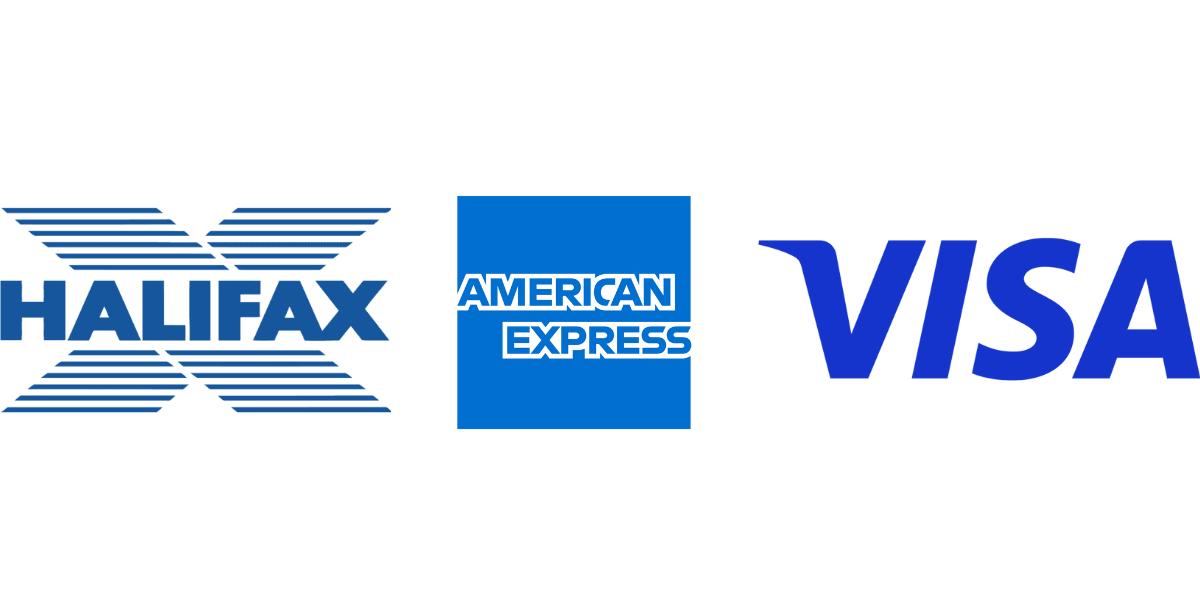
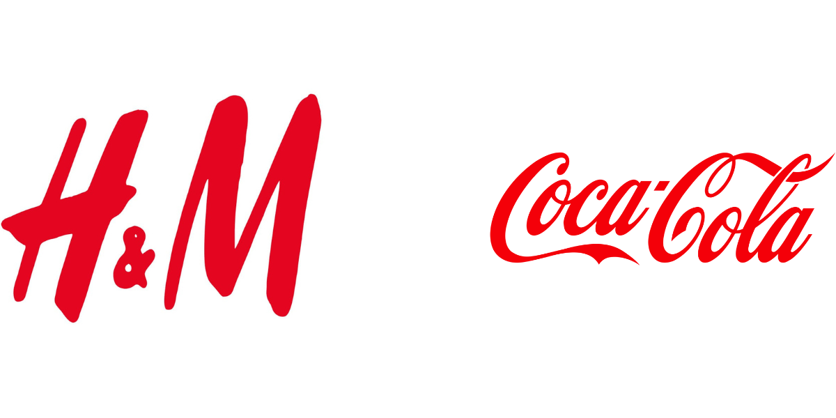
The colour red in logo design
The colour red, however, oozes confidence and passion. It also indicates urgency, which could possibly increase the likelihood of a sale. This is why the colour red works well for retail companies, who are looking for customers to make a quick purchase!
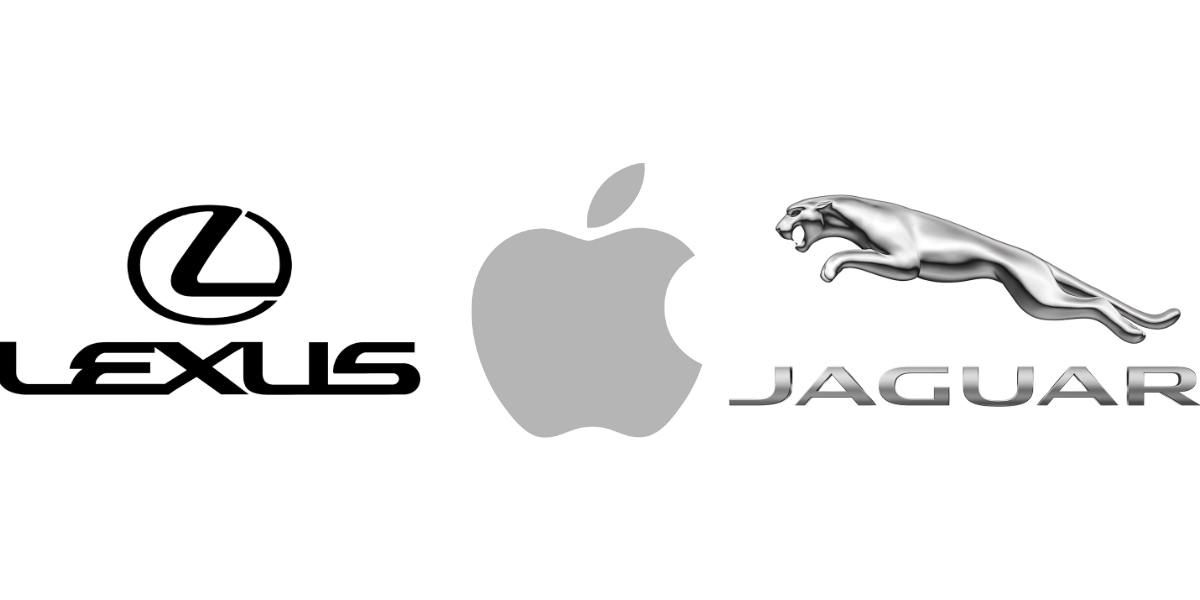
Black, grey and silver in logo design
Black, grey and silver tend to be popular choices within the automobile and tech industries. These colours are associated with power, sophistication and glamour – making them ideal to portray the luxury symbolism that goes hand in hand with a lot of high-end tech and car brands.
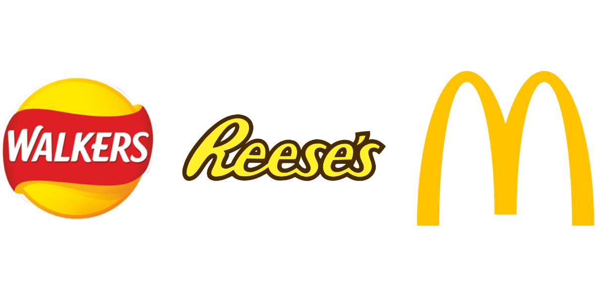
Yellow & gold in logo design
Yellow and gold, on the other hand, portray a sense of optimism and fun. For this reason, they don’t tend to work as well in industries that require a more serious outlook, such as medicine or security.
At Milk & Tweed, our yellow logo represents our personality and sense of fun. Possibly the most famous yellow/gold logo is McDonald’s ‘golden arches’. McDonald’s, a brand well known for their ‘Happy Meals’ have chosen gold to reflect the sense of childlike joy that they want their food to bring to their customers, young and old.
How to choose the right logo colour for your business
Studies have shown that colours can increase your brand recognition by 80%.
As well as this, consumers can make a subconscious judgement about a product or brand within 90 seconds of looking at it, with up to 90% of their assessment being based on colour alone.
As we have already discussed, most logos contain 2 colours – a base colour and an accent colour. In order to ensure that these colours work together, it may be worth using a colour wheel to find colours that will look nice when used in conjunction with one another.
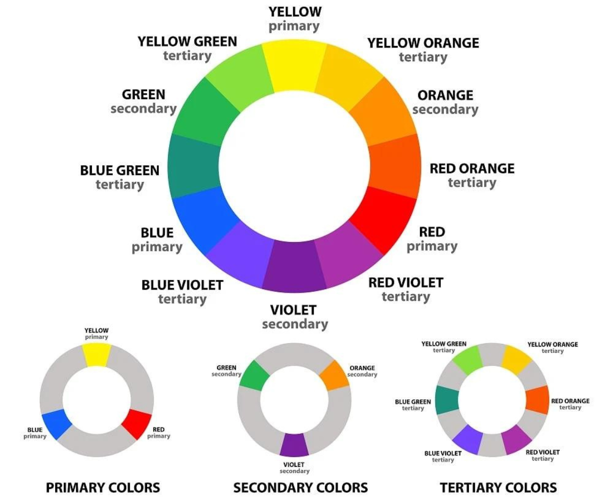
Looking at the colour wheel, we can determine three key colour schemes:
- Complementary colours
- Analogous colours
- Triadic colours
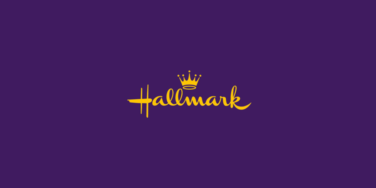
Complementary colours are colours that are opposite each other on the colour wheel – for example yellow and violet. These colours work together because they equally stimulate different parts of the eye. This means that they play up each other’s intensity while still appearing balanced; it’s a natural illusion that adds energy and draws in the eye.
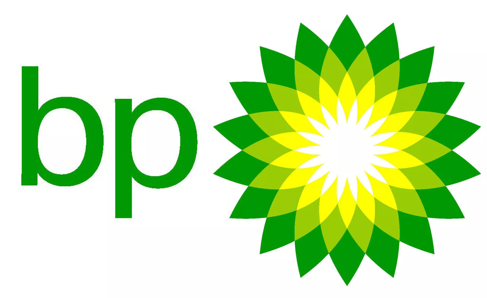
Analogous colours are three colours that sit directly next to each other in the colour wheel – e.g. yellow, yellow green and green. These colours work so well together because of their representation of colour palettes that regularly occur in nature.
Triadic colours refer to three colours that are evenly spaced around the colour wheel, such as yellow, red and blue. Triadic colours look so visually appealing together due to their contrast. They look vibrant and uplifting. They can make a logo stand out whilst still looking harmonious and balanced.
How Milk & Tweed can help
Once you understand the psychology behind colours and what colours look visually appealing when used together, you should be well on your way to choosing a logo that represents your business and showcases your company’s personality!
If you would like some help in designing a logo for a start-up or as part of a rebrand for an existing company, please get in touch with us here at Milk & Tweed and we will be happy to help.