Website Responsiveness

Your Website Needs to Be Responsive: A Guide With Zero Tech Jargon

Have you ever been on a website that looks great, works seamlessly and you can easily get from one page to another, to then come back onto said website on your mobile phone to find something that looks completely different? Images are being cut off, text is overlapping and you can’t get to any of the pages you were once on.

We’d willingly bet every single one of our coffee pods (and we don’t give those up easily mind you) that you have experienced this. This is a result of poor website responsiveness, a design fundamental that determines the success rate of your site.

Sounds a bit dramatic, doesn’t it? But we emphasise the point with both care and sincerity. After all, not everyone will be using the same device to visit your website so don’t create one that’s limited to just a singular screen size. For example, if your website looks really bad on a laptop screen then all those visitors will receive a bad experience and will just leave.

What is responsive web design?

Responsiveness is an approach to web development and design that simply means a website will adapt to suit the device it’s being viewed on, whether a 27” Apple Mac or a 6” Google Pixel mobile.

Responsive web design requires the content that sits on your website to be able to automatically scale to suit the screen size it’s being displayed on. Meaning that your website visitors can visually see everything they need to without sacrificing anything. This does however require elements to essentially ‘shape-shift’ so that they are displayed in an easier to digest view for users on devices of any size. For example, content sitting nice and comfortably in a multi-column element may need to be reduced to fewer columns to suit a mobile device.

The ability to make aspects of a website responsive also makes designers’ lives easier as it ultimately means no need for creating whole web pages designed specifically for mobile devices and instead a few shifts and adjustments to elements on a page is all that’s needed to make sure it alters to the desired screen size. See, it benefits everyone

Why does it matter?

Why doesn’t it matter?

A responsive website matters for the sake of your customers, internet bots and for your business’ success.

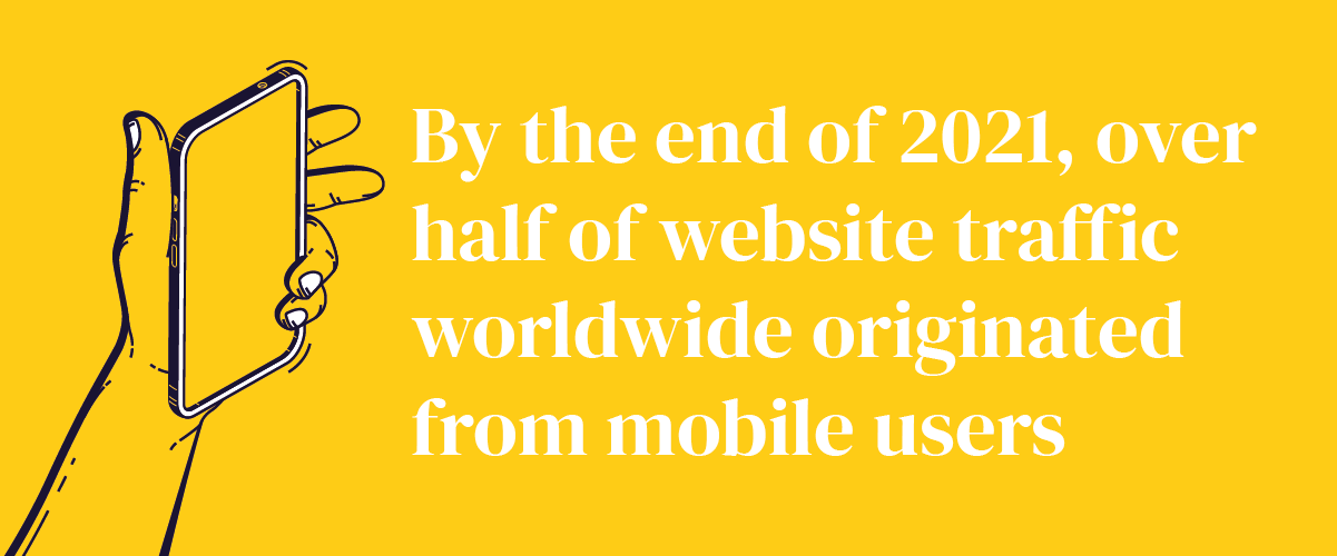
If your customers visit your website on their mobile device, they want to have a smooth experience and be able to get from point A to B without being confronted with hurdles such as broken buttons or text that doesn’t fit to their screen. The usability of your website and the users’ experience will be the ultimate make or break factor of your business. Roughly half of people who browse the internet will do so on a mobile, meaning that tailoring your site to suit the different mobile screen sizes is crucial to appealing to that majority. Plus, nobody is expecting mobile device usage to drop in the future so make sure your site is well equipped to handle the different types of tech we’ll have at our disposal going forward.

As well as tailoring your website responsiveness to appeal to your customers, you’ll also want to make sure that it suits the algorithms of those demanding spiders that crawl your site. No, not the creepy crawlies that love dark and dusky hiding spots, the bots that search engines send to scour the internet to index web pages in order to find the most relevant content. It’s going to sound biassed but those bots prioritise mobile devices first, simply because the mobile is the device that’s most popularly used to browse in today’s world. By applying responsiveness to your website, you’ll be checking some necessary boxes for the digital critters.

What about your competition? If they have a fab website that works on your customers’ mobile but your website doesn’t, who do you think your customers would choose out of the two? Inevitably, the website that actually works on their phone. And in that moment right there, you would have lost a potential customer to your competitor.

A good point for the keenest of entrepreneurs to consider when thinking about the importance of a responsive website is just how cost-effective the practice is. Rather than having to invest time, resources and people in building numerous different versions for each web page to conform to each device screen size, you can simply spend the time to perfect just one that can adapt to each screen. So much better in the long run!

How do I tell if my website is responsive?

Before understanding how to achieve a responsive website, you first need to determine if your website is responsive. You need to know how your website responds to different screen sizes to establish if it will provide the best possible experience for your site visitors. For example, does content move, look unreadable or break when the screen size is changed?

For just a visual view of your website, you can just manually adjust your web browser tab to about half the width of your screen for tablet view and about ⅓ the size of your screen for mobile view.

Now that you’ve had a quick gander at your site, let’s explore what you can use to technically determine if your website is in need of a responsive pick-me-up. There are so many different tools out there in the vast wilderness of the internet you can use to test your website or a specific page on your site and we’ve rounded up a few of our top picks:

How do I achieve responsiveness?

Now that you’ve determined if your website is responsive, it’s time to identify best practices for achieving a responsive website:

Set breakpoints

This is the mark at which a website’s design will adjust to suit certain devices. These breakpoints are defined using code in the back-end of a website and a site will respond to these points to adjust itself to suit the screen size it’s being displayed on.

Consider touchscreen

The majority of mobile devices we have our hands on now are, well just that, hands-on. Touchscreen is a huge factor to not be forgotten when designing with responsiveness in mind. Elements such as drop-downs will need to be large enough that our Homosapien thumbs can press them with ease. Additionally, if you’re wishing to add some form of ‘hover over’ item, you’ll need to consider adding an element that’s mobile exclusive on your website that is a ‘swipe-to-view’ box instead.

Optimise optimise optimise

Whilst it’s tempting to just throw every last drop of information, style and customisation onto your website, resist the urge to. The number one thing people want when visiting your site (whether they know it or not) is to have a smooth and seamless experience. Optimising your content and elements to suit the user experience and all device types will help your website to stand out.

Consider what to include on smaller screens

Smaller screens have smaller capabilities so go gentle on them. Only include what is absolutely essential and what the user will want to see. Mobile devices are more leaned on for quick results and your visitor will likely only be stopping for a short period of time, so try not to bog them down with all the nitty-gritty bits.

Make it accessible

Be sure to keep in mind people who may have accessibility needs or impairments that need to be catered for. Even if you don’t plan on directly making changes to your website in its final form, including options to alter the website for accessibility purposes. Even making sure that text is large enough is one step towards achieving accessibility.

Outsource

Consider outsourcing to an agency or business that specialises in website development and building. Maintaining all of these practices and keeping up with them is quite the handful but sharing the workload with professionals who have the expertise in making responsive websites can help you with carrying the weight.

And don’t forget to test, test, test.

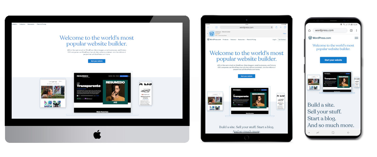
Examples of: The Good and Bad

The Good 😇

Previous
Next

The Bad 👿

Previous
Next

So, our conclusion? Look out for your future self and fix those cropped images that don’t capture the full story, the headlines that read on about 20 lines instead of just 1 or 2 and the infinite side scroller where you end up in an entirely different dimension.

We can be your first responders to help out if fixing these responsive issues is just a bit too much to handle. After all, we have bucket loads of experience with websites 😎

Email: studio@milkandtweed.com
Phone: 01249 847 447

Let's create together

Get in touch

Select your plan and one of our team will get in touch