
Logo ideas to get the juices flowing
Here at Milk & Tweed, we have designed over 100 logos, for a number of different businesses. No matter your business size or target audience, we can create a logo that will work for you.
Like this logo?
View Logo ProjectLike this logo?
View Logo ProjectLike this logo?
View Logo ProjectLike this logo?
View Logo ProjectLike this logo?
View Logo ProjectLike this logo?
View Logo ProjectLike this logo?
View Logo ProjectLike this logo?
View Logo ProjectLike this logo?
View Logo ProjectLike this logo?
View Logo ProjectLike this logo?
View Logo ProjectLike this logo?
View Logo ProjectLike this logo?
View Logo ProjectLike this logo?
View Logo ProjectLike this logo?
View Logo ProjectLike this logo?
View Logo ProjectLike this logo?
View Logo ProjectLike this logo?
View Logo ProjectLike this logo?
View Logo ProjectLike this logo?
View Logo ProjectLike this logo?
View Logo ProjectLike this logo?
View Logo ProjectLike this logo?
View Logo Project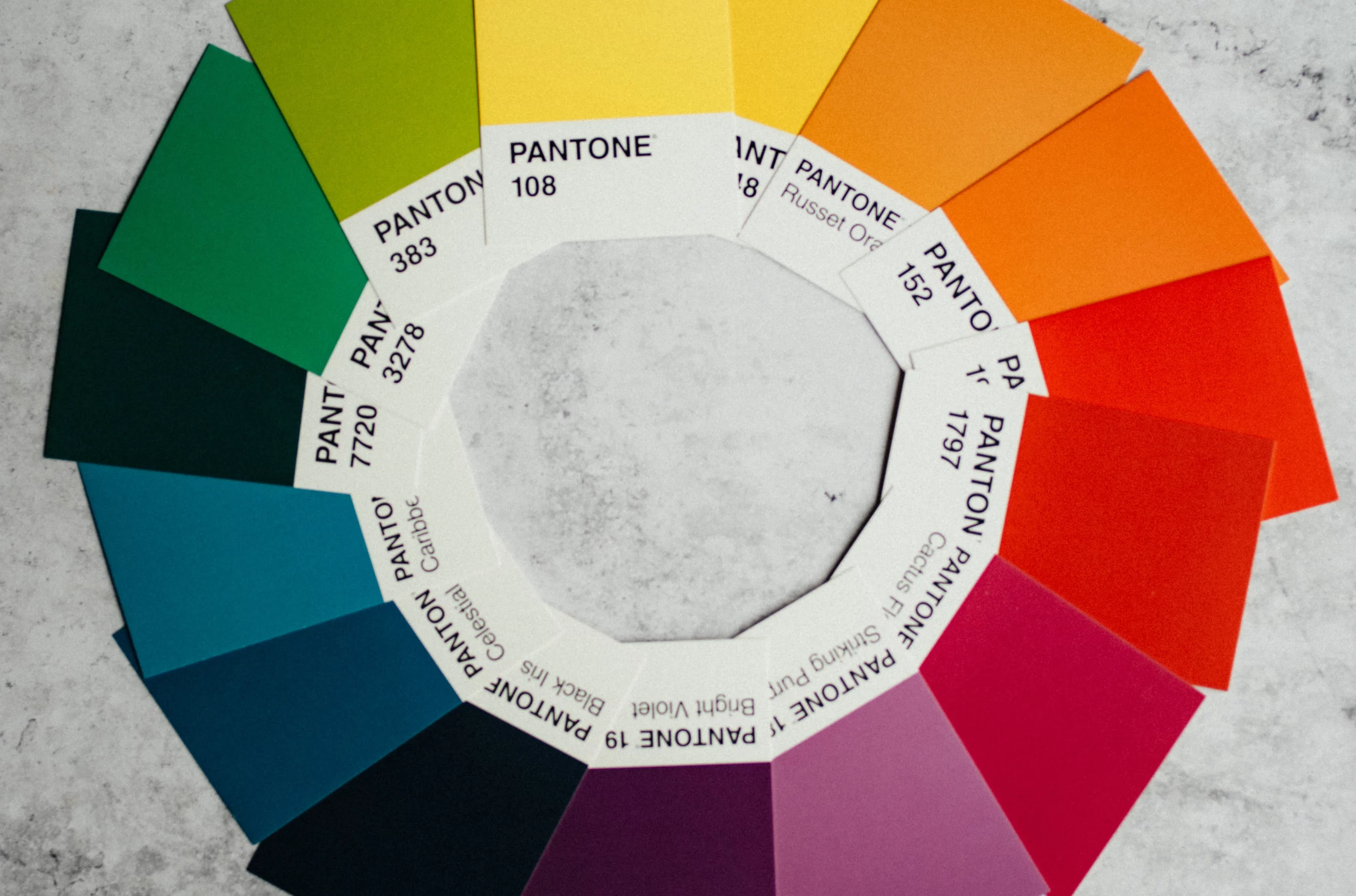
Colour
The colour of your logo is a powerful way of sharing your company’s personality. They should reflect your business and attract your target customer.
Colour psychology means that different colours work better in different industries. Blue, for example, is commonly used in industries where trust is imperative, such as finance and security, whereas yellow can trigger happiness. The colour that you choose should reflect how you want your target customer to feel when they see it.
Brand Mark

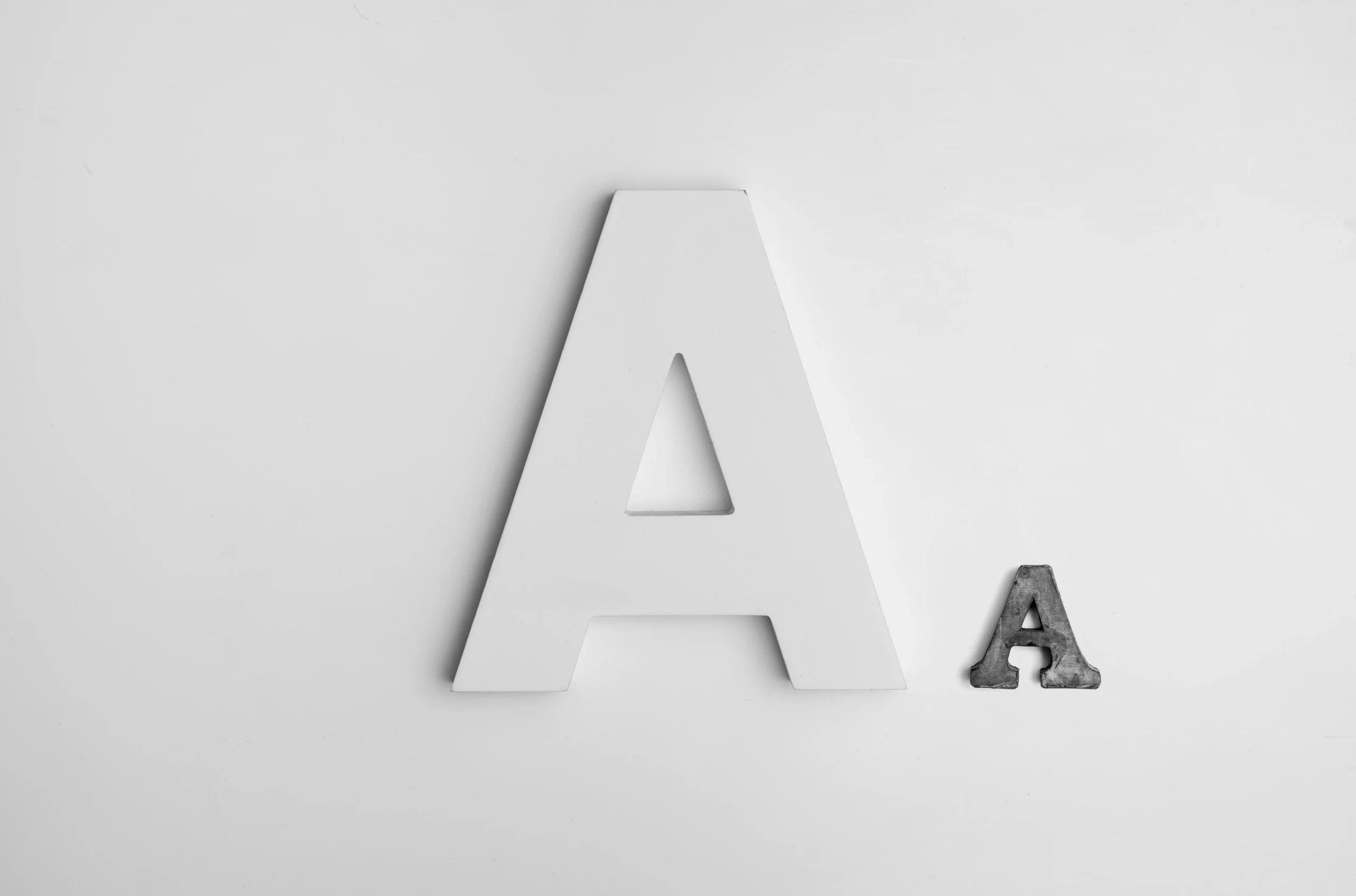
Typography
There are a lot of different choices to make when deciding on your logo typography. You have to choose whether you want your font to be serif or sans serif, and work out the spacing between and around the individual letters.
And you have to remember the importance of it being legible in multiple different formats and in different colour ways.
Layout
You will also have to decide which part(s) of your logo you want to stand out the most, and demonstrate the visual hierarchy within the layout of your logo.