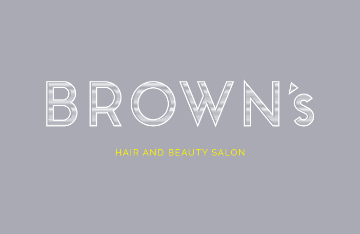
Wanted to create a stylish and sophisticated logo design and brand that represents the clientele and the beautiful City of Bath.
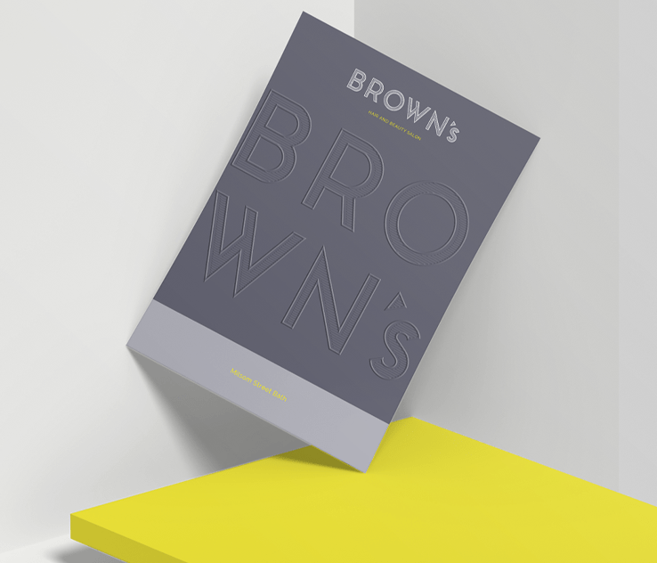
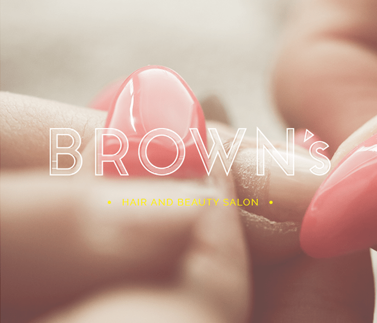
We modified and created the word Brown’s in it’s very own font, we wanted it to look classy yet modern. With the colour palette we went for a nice subtle grey, teamed with a bright yellow and pink to really give that contemporary classy feel but with a modern vibrant twist.
With the website design we wanted it almost to feel like old beautiful editions of Vogue, French and Italian style and beauty influence with a British twist.
So an editorial style layout was applied to the website to make it feel almost like a magazine. We have also designed many other bits of material for Brown’s and continue to do so.