

Heatmaps. We see them every time we watch the weather forecast on TV. And while heatmaps for websites aren’t exactly the same, they have a similar principle. Unsure how we can draw the connection between websites and the weather? Have no fear! In this article, we will dive into exactly what heatmaps for websites are and why you should use them. Let’s get started!
What is a heatmap?
Heatmaps are tools that provide valuable insights into user behaviour on a website. Where the user has clicked, scrolled to, or even ignored on a webpage. This data will allow the website owner to make data-driven decisions to improve the user experience and optimise their websites.
Similar to weather forecast heatmaps that show the intensity of different weather types in a certain area, heatmaps for websites show the intensity of user interaction with different elements of your site. These maps use different colours to showcase which parts of your websites achieve the most attention.
What are the different types of website heatmaps?
There are several types of heatmaps commonly used in web analytics, depending on what you want to track. It is usually best practice to combine a few of these different heatmap types, in order to achieve a more holistic view of your website’s user experience. There are three main types of heatmaps that are found on most heatmap tools.
Click heatmaps
Probably the most common type of website heatmap is a click heatmap. These show where on a webpage generates the most clicks. They are colour-coded, with warmer colours indicating more clicks and cooler colours showing less clicks. These types of maps allow website developers to identify the most (and least) popular elements on a page and see how users interact with various different features, including buttons, images and links.
Scroll heatmaps
Scroll heatmaps work a bit differently to click maps, in that they show how far users scroll down a particular webpage. This usually means that the top part of the webpage (the bit showing the header and first few bits of information) are the most viewed and so are shown in red, and the colour becomes cooler the further down the page you scroll. These maps allow website developers to see how far down a page a user is getting and alter the layout so the user sees the most important information higher up.
Mouse movement heatmaps
Mouse movement heatmaps show the path of a user’s mouse as they navigate their cursor around a webpage. These maps allow you to see how users are moving around your website. Does the user hover over a button or link but never press it?
Additional heatmaps
There are two other types of heatmaps that can be used to understand customer data. These are eye tracking heatmaps and conversion heatmaps. Eye tracking heatmaps provide insights into where users focus their attention on a webpage. These heatmaps are created using eye-tracking technology, which records the movement of a user’s eyes as they view and interact with a website. This of course requires additional functionally and the users webcam to capture eye movement.
Conversion heatmaps follow the user’s journey to conversion. They allow developers to view each step that a user takes to complete a desired action, such as clicking a call to action or making a purchase. They are useful to identify bottlenecks in the conversion process, and can help you to amend your website design and function to streamline the conversion process.
Why should you use website heatmaps?
Website heat maps are useful tools for helping you to get the most out of your website. They can help you to find the perfect design, remove distractions and streamline your call to actions, as you get a clear picture of what your users are actually engaging with, and what they’re ignoring.
Click maps also allow you to see problem clicks – when users click an element or image on your site expecting it to be a link, but it isn’t.
All of these insights will allow you to completely optimise your site for user experience. You can amend your site based on hard data, rather than guesses and assumptions.
How to create a heatmap
Creating a website heatmap involves tracking user interactions on your website and then visualising that data to understand how users engage with different elements on your site.
The first step you need to take is to choose a heatmap tool and create an account. There are several heatmap tools available that can help you track and visualise user interactions on your website. Some popular options include Hotjar, Crazy Egg, and Mouseflow. Choose a tool that suits your needs and budget. (We use Hotjar – in case this helps you to choose!)
Once you have signed up to your chosen tool, you need to set up your website tracking. This typically involves adding a tracking code or script to your website’s HTML. There should be simple instructions within your chosen tool to help you do this.
Once your tracking code is in place, log in to your heatmap tool’s dashboard and create a new heatmap project. Specify the pages you want to track and configure the settings to match your data requirements.
Allow the heatmap to collect data from users who visit your website. It may take some time to gather enough data for meaningful insights, so be patient. Once you have collected enough data, you will be able to access the results and analyse the data in order to gain insights into your user behaviour. You can use these insights to optimise your website and its elements in order to keep your audience engaged throughout the page.
How to use a heatmap
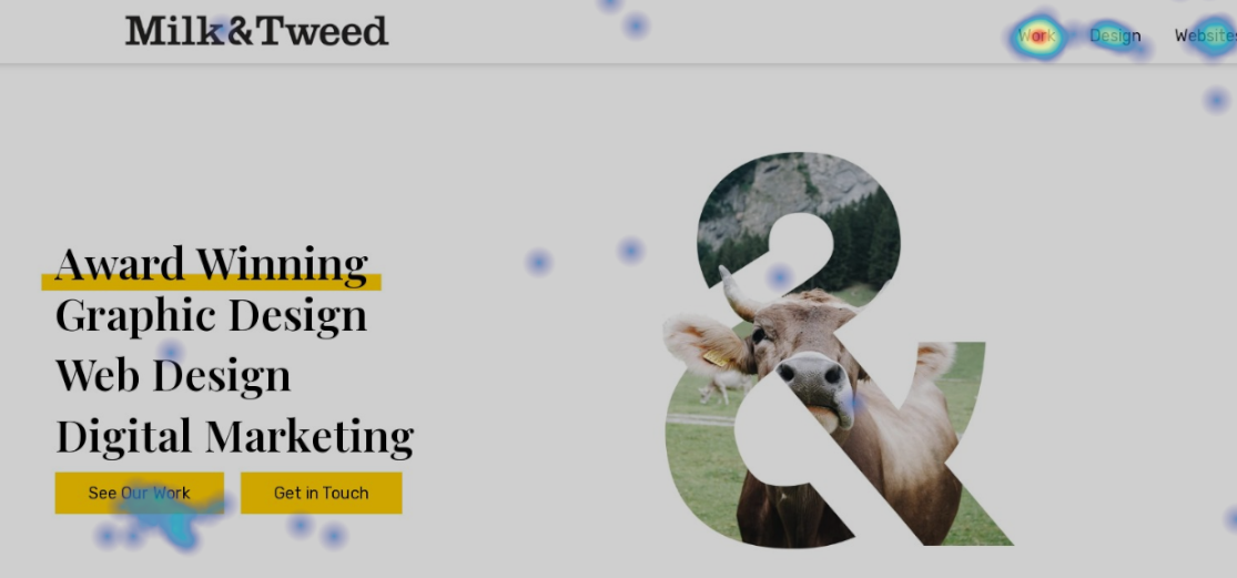
To be able to analyse a heat map you firstly need to think outside the box, but also look at the obvious. For example, if we look at this screenshot from our home page, we can see that most of our users clock the ‘See Our Work’ button and the ‘Work’ menu option.
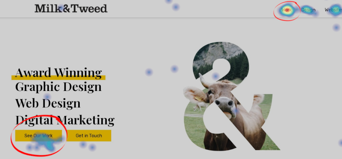
This tells us that most people who visit our website want to see examples of our work. However, this doesn’t necessarily mean they are looking for our logo or website designs, they may click this to see our case study work. So to fully understand what people want we could then change the ‘Get in Touch’ button to ‘Marketing Case Studies’ and see what is getting clicked more.
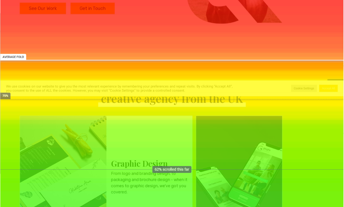
Another way that we can use heatmaps is to discover whether our webpages are too long. Take this service page for example.
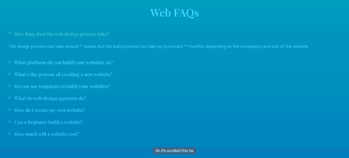
This scroll map shows that only 36% of people make it to our FAQ section. This means there are a lot of people missing this important section. So if we were to see it as valuable information, we could move it up.
If you need help implementing a heatmap for your website or you need help analysing one, our amazing digital marketing can help.