

At Milk & Tweed HQ, the words ‘white space’ are thrown around a lot. But what do the design team actually mean when they keep uttering these two words? In this article, we are going to delve into what white space means in the design world, why it is important, and some of the challenges budding designers may face when incorporating it into their portfolios. Let’s jump in!
What is white space in graphic design?
White space, otherwise known as negative space, is neither white nor negative. It is simply an area of empty space between the elements and text in a design. It can also refer to the space between readable characters (individual letters) in a word – although this is usually called ‘kerning’ or ‘tracking’.
As we’ve said, white space doesn’t have to be white, though it can be. It can be plain, coloured, patterned or textured – as long as it is ‘empty’.
What are the different types of white space?
There are a number of different types of white space that are used in different designs and for different reasons.
Micro white space
Micro white space refers to the space between smaller design features, such as letters, text lines, paragraphs and icons. Incorporating micro white space into your designs will often come naturally, however it is important to ensure the legibility of text and other details.
Macro white space
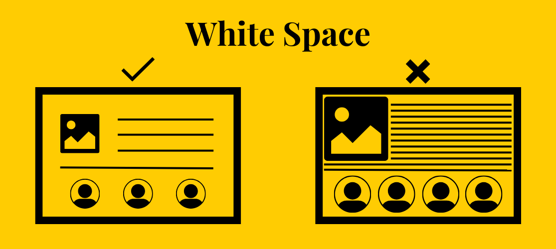
Macro white space, on the other hand, is the larger space between bigger elements in the design, such as column spacing and the area between graphics. Rather than being used to improve readability of individual details, macro white space is used to structure the layout of a design, defining the arrangement of major features and content blocks. When using macro white space in your designs, you must consider the proportions and distribution to ensure it complements the content and maintains an overall sense of coherence.
Passive white space
Another way of categorising white space is by how much – or little – attention it draws. Passive white space is designed to be unnoticed. It’s employed to format text, structure paragraphs, and arrange icons with precision. Though it goes unnoticed, passive white space is deliberately added in a subtle, almost imperceptible way to allow viewers to read the information effortlessly.

Active white space
Active white space is used to draw the reader’s attention to a particular feature, such as a logo, headline or graphic. Macro space is always intentionally used to draw the eye to a certain element, so macro space is the same as active space.
Why is white space important in graphic design?
White space is an integral component of graphic design. Depending on the piece that’s being designed, white space can have various different impacts. For example, in leaflet design, the white space can significantly improve the aesthetics of it, whereas in website design, white space can not only impact its look, but also the user experience of the page. Here are some of the biggest reasons that white space is important.
Improving legibility
Noone will want to purchase from your company if they can’t read your marketing materials. White space is imperative for ensuring that the wording within your designs can be read and understood. The below graphic shows the difference between proper and improper use of white space.
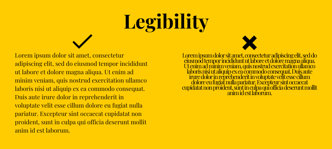
Both paragraphs read exactly the same. Not that you’d know, because you can hardly read the second example due to the lack of white space between letters and lines.
In fact, studies have shown that good use of white space between paragraphs and in the left and right margins increases comprehension by almost 20%. In an article titled The Impact of White Space on User Experience for Tablet Editions of Magazines, Fanyi Cheng found that three fixed effects – macro white space, micro white space, and an interaction between the two, had a ‘statistically significant impact’ user experience.
Building hierarchy
Because white space helps to direct the reader’s eye around the page, it is a useful tool for building a hierarchy. Hierarchy helps the reader to understand what the most important elements of a design are.
In this image of the Carl Todd Clinics website that we designed, our clever use of white space allows the user’s eye to travel along the line of important information – from the headline, to the image, to the buttons, to the text.
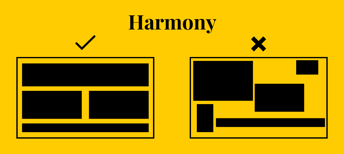
Enhanced harmony
A design that doesn’t make the best use of white space, or even completely ignores it, can end up looking unbalanced and distracting. Harmony plays a significant role in graphic design because it’s what gives a sense of cohesion and balance. While there are various factors at play when it comes to achieving harmony, white space is definitely one of the most important design factors.
What are some challenges when it comes to white space?
While white space is a vital tool for ensuring the legibility and balance of your designs, designers can come across various challenges when working with it.
Finding the balance
Finding the right balance between white space and content can be challenging. Too much white space can make a design appear unfinished, whereas too little can make it cluttered and overwhelming.
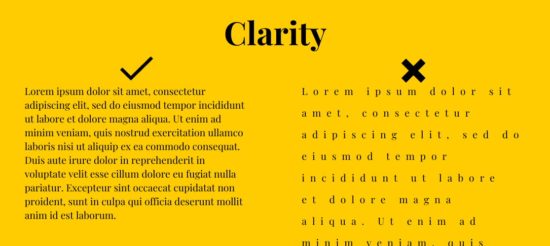
Clarity vs. Aesthetics
Designers must strike a balance between creating an aesthetically pleasing layout and ensuring that the design effectively communicates its intended message or function. Sometimes, excessive white space can compromise clarity.
Responsiveness
Designing for different devices can be difficult. White space that works well on a desktop may not translate effectively to smaller screens and could require additional adjustments to maintain a balanced design.
Brand Consistency
It can be difficult for designers to maintain brand consistency when working with white space. Striking a balance between aesthetics and adhering to brand guidelines can be challenging.
Collaboration
Often, designers won’t be the only people working on a piece – working with other team members, such as copywriters, developers, and marketers will be essential. Collaboration is useful, as it allows for enhanced creativity, increased efficiency and diverse perspectives. However, ensuring that everyone understands the role of white space in the design and its impact on the overall project can be challenging.
For example, one of the biggest challenges designers face industry-wide is trying to fit 10 pages of content from the copywriters into a single A4 sheet, whilst still making it legible and aesthetically pleasing. When everyone is on the same page – pardon the pun – about white space and its importance, it may make the life of the designer slightly easier.
Design Trends
Staying current with design trends and knowing when to avoid them can be challenging. Some trends may misuse white space, reducing the effectiveness of the design and making it less visually appealing.
How Milk & Tweed can help
At Milk & Tweed, our designers are White Space Wizards! If you need help designing your logo, website, or any other marketing materials, get in touch with us today. Our friendly team of graphic designers will be happy to help!